
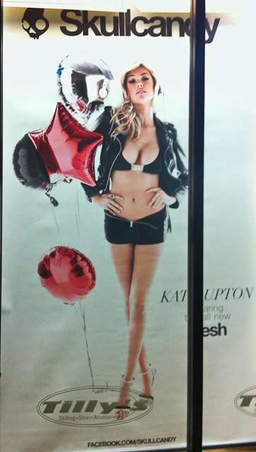
 I was walking through my local shopping center one evening last week when I was stopped in my tracks by this Skullcandy poster in the window of the Tilly’s store. What stopped me was not the model (is this a sign I’m getting old?), but the poor photography. It is not a very well done photograph. There are numerous things that I consider wrong with this poster and if I had taken this shot, I would have discarded it during my initial selection process. Here are a few of the things I think are wrong
- Pig Nose – Kate has her head tilted back and the photograph was shot at a slight upward angle, resulting in a very unattractive nose. This alone should have sent this photo to the discard pile.
- Reflections of the studio lights in the balloons. I find these extremely distracting and would have either rejected the photo of cloned them out.
- Blown out hair on top of her head. Although my cell phone shot here doesn’t do it justice, the whole photo was poorly exposed.
- You can hardly see the product! In fact, I did not see the headphones until after I had read all the text then gone back to the photo. Some say that might be OK, because I did read the text, however, I think you should have both.
Apparently the Art Director was judging the photos by how great Kate’s boobs looked and all the other stuff was secondary. Supermodel Cleavage trumps a good photo.
To give the Art Director credit I did find other shots from this shoot that are much nicer photographically. Here is one from Skullcandy’s Facebook page. I’m just shocked that this one made the cut.