How do I select my best work? After my last post, A Good Crop – My 2015 Photos, I had multiple people ask me what was my selection criteria for selecting my best images of 2015. My first thought was that they must be saying “How could he pick that piece of crap as his best photo?” But perhaps they really wanted to know. Looking at the images as a group there does not seem to be any common theme between them which makes the selection criteria difficult to grasp.
So I’m going to answer both possible questions and explain my selection process and how I went about determining my best images of 2015.
Selection Criteria
Here are the things I look at when evaluating my photos and trying to determine which are my best.
- Story
- Graphic Elements
- Emotion
- Does it evoke an emotion
- Do I have an emotional attachment to the image
- Audience Response
- Feedback for people who see my images
- Juried exhibits and shows
Story
The strongest photos are always the ones that tell a story. It doesn’t have to be an overt story, in fact I try to make the story ambiguous, so the viewer comes to their own conclusion based upon their own life experiences. Many of my best of images this year are on the list because of the story they tell.
Graphic Elements
I think of graphic elements as a combination of composition, and the way the various shapes in the image interact. Abstracts and may of my street images rely on these shapes since there isn’t really a story to tell. Strong graphical elements are going to draw the viewer’s eye and become the obvious subject of the image.
Emotion
The emotion criteria involves evaluating two types of emotions responses, one good, one not so good.
The Good Emotion
When looking at the photo the question I ask is, “Does the photo evoke an emotional response in the viewer?”. A sign of a good photograph is one that gets an emotional response, any response, the type of emotion is unimportant, what IS important is that it makes the viewer feel something.
Emotional Attachment
The other type of emotion that I experience is that I remember the emotions I felt when I took the photo. These emotions are not necessarily good because they cloud my judgement and prevent me from making an impartial decision about the worth of an image. I typically try to avoid any emotional attachment when selecting photos, but sometimes my feelings are so strong for an image I will include it in my selection. I just like it! Often that emotional attachment is partly influenced by the audience response.
Audience Response
Ideally I am taking photographs for myself and not to please others. To truly be art the image has to come from me, and not be influenced by what I think my audience might like. This is a constant struggle, and I try to not think of my audience when I take a photo, but often I know it is going to resonate with my audience the moment I click the shutter. More often I will like an image that my audience does not, or I will show people an image I think is just OK and they love it. I initially considered this audience influence as a negative, but have come to realize it is just another piece of the selection process.
Getting Feedback
I am constantly showing my portfolio to people, friends, family, photographers, models, strangers, pretty much everyone I meet. I always look for what images they respond to, which ones to they comment on, which ones do they stare at a little longer than others, which ones do they flip through quickly. This feedback influences my decision on what are my best images. The responses are weighted by who is giving the feedback. If it is my Mentor then it is instantly going into the short list, on the other hand my non-photographer friends have less weight. Audience response alone does not select a best image, but it is just another data point when I’m making my decision.
Exhibits and Shows
I entered photographs into 24 juried exhibitions and contests this past year (a blog post is coming soon about that experience). In 15 of those competitions my images were selected for the show or won a prize in the contest. This tends to make me think more highly of these images and makes it more likely that I will pick it as one of my best. However it mainly affects older images, I only submitted 2015 images in a couple of shows. But it does influence my perception of the value of my images. Several images from past years have won numerous times, so I’m inclined to think more highly of those images. 🙂
Analysis of My Best non-Model Photos
I find it more difficult to determine my best photos from my street and landscape photos. In general they tend towards more abstract images and that is so subjective, I ended up not picking any of my abstract street photos as my best even though I like quite a lot of them.
Shadow Walkers
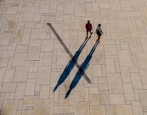 This image is all about the strong graphic ‘X’ created by the shadows crossing the line on the ground. This image as also gotten good audience feedback both from contests and individuals, I have had several people email me to tell me how much they like the image, that is rare.
A Time to Himself
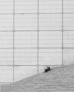 I picked this image because I think it tells a strong story and evokes an emotional response. It is also strong graphically with the huge negative space above the man, helping to strengthen the story and the feeling of isolation.
I submitted this into a critique at my local camera club and the judge suggested cropping the top, there were a dozen people in the audience who yelled “No!”. It is very rare for anybody in the audience to do such a thing, but it tells me that my instinct about the graphic element of the negative space was correct. (The judge ended up giving it 3rd place).
The Pose
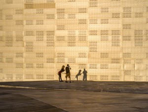 I picked this image mainly because of my own emotional attachment to it. It does tell a good story and the gold background and shadows make for a strong graphic element, but this image just barely made the cut.
Feet Above
This image is the most abstract of all the best images. It has strong graphics, it also has a reasonably strong story. Audience feedback is non-verbal, instead people tend to linger on this image. Making people pause on an image is always a good thing.
Desert Road
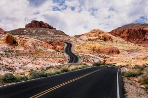 This image barely made the cut as one of the best images for 2015. The main reason it did was because of audience response, every person who sees this image comments on it, ohhs and ahhs, etc. I think it is because of the colors and the road is certainly a strong graphical element, however I think it is just an average image, but the audience thinks differently.
Analysis of My Best Model Photos
Reflection and Ripples
I believe this is my top image of 2015. This is more from personal emotion than anything else. Both the graphics and the story are strong, but my opinion is more subjective for this image than any other. Whenever I come across this image I just like it. Although I feel like I should know why, I can’t articulate it.
What is your reaction?
Nestled
 For the past three years I have been working on a body of work of nudes in the rocks, where I try to make the human body fit into the rock landscape, this image is a great example of that.
Strong graphical elements, with the rock following the curve of her body. The story is told by the lines in the sand coming from her fingers. Without that it would just be a good image, that small element adds emotion and story and brings it into the top of the list.
Melissa Jean
This image is all about the graphic element of the curve of her body. The negative space also adds to the graphical impact. The shadows add mystery and create a small story element, but it is dwarfed by the graphical elements.
At the Cross
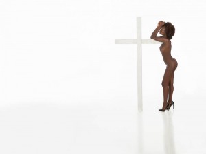 This is image has a strong story. It is an ambiguous story which is my favorite type to do in my images. It causes the viewer to pause and create their own narrative for the image. I also like the graphic elements, the minimalism, the negative space, the reflections on the floor all add together to make this image make the list.
Nude in the Rocks 4
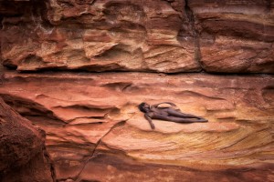 I picked this image because of the strong graphical content, the model fits into the curves of the rock, her horizontal position ties into the horizontal lines of the rocks. This image also gets a very strong audience response, partly because of the composition, but also because of the color palette, people seem to respond well to it.
Acroyoga on the Shore
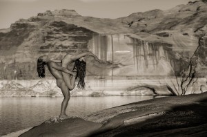 This image has a reasonably strong story but the compositional elements are the star. The shapes of the bodies are interesting, the curve of the female’s body mimics the curves in the rock across the water. I deliberately framed the image so the model’s hand just touched the curve in the rock.
Tasia in the Rocks
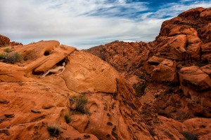 I choose this image because of the scale of the landscape vs the model. I like to call my “Find Waldo” photo. This is more of a personally emotional image. It is another one where I just like it even though it doesn’t resonate with most of my audience.
All Heart
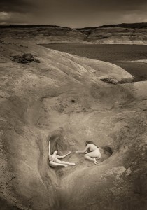 This is another image where I like the scale of the image, the heart shape depression they are resting in is a fairly strong graphical element, their interaction is part of the story.
Lost
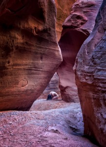 This image is about story and emotion. The canyon walls make for an interesting composition and frame the model nicely, but that is secondary to the model’s pose and isolation.
Summary
So there is my thought process for why I selected these 14 images as my best of 2015. As you can see some are a little arbitrary and a month from now they could be replaced by other marginal images, that didn’t quite make the cut.
Let me know your thoughts, which ones do you think shouldn’t have made the cut?

