Critique of my Photos
Meetup.com
At the Google Plus Photographer's Conference earlier this week I talked to a lot of photographers who were just getting into photographing people. Several had shot some of the models at the conference and discovered how much they loved it. (I know the feeling).
Most of them were asking me how to get started with model photography and I recommended joining a local Meetup.com photography group and going to a few meetups. A lot of the groups schedule model shoots and they are great for learning posing techniques, some lighting, and just getting comfortable in the studio.
For the Bay Area photographers, here is the list of meetup groups I am a member of. Not all of these do model shoots, but they are all worthwhile. Check them out.
A SOUTH BAY DIGITAL PHOTOGRAPHY GROUP
*ARTISTIC GLAMOUR AND FINE ART PHOTOGRAPHY CLUB*
Adobe Creative Suite User Group - San Jose
BAMPS - Bay Area Model Photo Shoots
Bay Area Image Maker's Collective
Bay Area Photographers Working Together
The Bay Area Photography & Exploration Society
Chasing Light N Photographing Landscape
Creative Portraiture in Santa Cruz
Digital Photography Society of Santa Cruz
EXPOSED - A Photography Showcase
Fremont Digital Photo Freeschool
Hold the Eye Images Meetup Group
Jules CAFE Photo Peeps Meetup and PUG
Northern California Bikini & Boudoir Workshops
Photography Classes and Workshops - All Levels
Photolight - Photography & Lighting (SF Bay Area)
Renegade Photo Shoots - Bay Area
The San Francisco Photography Meetup Group
San Jose Photoshop Users Group
SF Bay Area Glamour and Fine Art Nude Photography
Silicon Valley Digital Photography Workshops
The South Bay Photography Meetup Group
This Week in Photo (TWiP) & SmugMug Bay Area Meetup
Supermodel Cleavage Trumps Good Photography
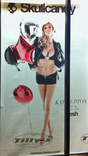 I was walking through my local shopping center one evening last week when I was stopped in my tracks by this Skullcandy poster in the window of the Tilly's store. What stopped me was not the model (is this a sign I'm getting old?), but the poor photography. It is not a very well done photograph. There are numerous things that I consider wrong with this poster and if I had taken this shot, I would have discarded it during my initial selection process. Here are a few of the things I think are wrong
- Pig Nose - Kate has her head tilted back and the photograph was shot at a slight upward angle, resulting in a very unattractive nose. This alone should have sent this photo to the discard pile.
- Reflections of the studio lights in the balloons. I find these extremely distracting and would have either rejected the photo of cloned them out.
- Blown out hair on top of her head. Although my cell phone shot here doesn't do it justice, the whole photo was poorly exposed.
- You can hardly see the product! In fact, I did not see the headphones until after I had read all the text then gone back to the photo. Some say that might be OK, because I did read the text, however, I think you should have both.
Apparently the Art Director was judging the photos by how great Kate's boobs looked and all the other stuff was secondary. Supermodel Cleavage trumps a good photo.
To give the Art Director credit I did find other shots from this shoot that are much nicer photographically. Here is one from Skullcandy's Facebook page. I'm just shocked that this one made the cut.
22 Useful Photography Cheat Sheets
Here is a post on PhotoPoly where they have compiled a list of photography cheat sheets. Some great stuff here.
http://www.photopoly.net/22-useful-photography-and-photo-editing-cheat-sheets/
Steal Like An Artist - The Book
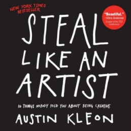
A year ago I did a blog post about an article on Austin Kleon's web site where talked about 10 ways to unlock your creativity. He has now expanded on this idea and written a book called "Steal Like an Artist". I stumbled across this book while in the bookstore and have thoroughly enjoyed it. It's a relatively quick read but it is packed with ideas on how to be more creative and how to channel your energy in your creative endeavors.
I highly recommend it.
Steal Like an Artist: 10 Things Nobody Told You About Being Creative
Have You Registered Your Photos?
In the past few weeks I've had several photographer friends who have had their photos stolen and in one case one was put on a stock photography site. Neither of these photographers had registered their photos so the only recourse they really have is to request the photo to be taken down, but they will unlikely ever recover any money.
I've been meaning to register my photos with the US Copyright Office for the past year, but I kept putting it off. These incidents made me decide it was time to do it. However I wasn't quite sure how to proceed. I had heard some good things about this book and decided to give it a try.
Photographer's Survival Manual: A Legal Guide for Artists in the Digital Age (Lark Photography Book)
by Edward Greenberg and Jack Reznicki
It's an easy and quick read that describes copyright law and why you should register your photos. But the most valuable part of the book was a step-by-step walk through of submitting your photos to the copyright web site. The web site is not the most intutive or user friendly site and without the walk-through I would have been lost at several points during the submission process. It took about 20 minutes the first time through, but now that the initial information has been filled out it should only take a couple of minutes for the next submission.
The most time consuming part was compiling all my images to upload. I only registered images that had been published, which includes anything put in public view on my web site, Flickr, message boards, etc. That ended up being just over a thousand images going back to 2001.
My plan going forward is to register my photos every quarter. This should be a good trade-off between protection and finding the time to do it.
I highly recommend the book and recommend you register your photos.
Improving Content Aware Fill
Photoshop CS5 added the feature Content Aware Fill which is an amazing tool which I use quite often. However with certain images it often has difficulties and I end up having to do a lot of manual cleanup after using Content Aware Fill.
I recently came across this video by Dave Cross where he shows a great technique for improving Content Aware Fill. I've tried it a few times now and have been impressed with how easy it is and how it addresses the problems I had been having. Give it a try.
Make Content Aware Fill even Better from Dave Cross on Vimeo.
2012 Best Picture Nominees
Every year my goal is to watch all of the Best Picture Nominees for the Oscar. This year I met this goal on Sunday night, a week before the Oscars, on a red-eye flight from San Jose to JFK Airport in New York by watching Tree of Life on my iPad.
There were some very good movies this year and surprisingly some bad ones as well. Here is my take on the 9 nominated films in the order I watched them.
Money Ball
I enjoyed this movie a lot. Part of that might be because it was about my local team the Oakland As. Great performance by Brad Pitt and and solid performance by Jonah Hill. Good solid A.
The Descendants
This was a slice of life movie about a slice of life I don't really care about. There were A LOT of scenes that were just 30-50 seconds of George Clooney's face, looking sad, looking pensive, looking lost, no dialog, just George's face. The first one went a bit too long and caught my attention, I was then distracted throughout the entire movie whenever it happened again and as I said it happened a LOT. Besides this the acting was all good, but as I said I found the story not that interesting. I am very surprised by all the accolades this movie has received. C+
The Help
Very well done movie, I think it was the best of the bunch. Good story, good acting, not much more to say. A+
The Artist
This movie pleasantly surprised me. I didn't think I would enjoy a silent movie, but after 10 minutes I didn't even notice that it was a silent movie. The story and acting was so well done it kept me engaged and sucked me in, the sign of a good movie.
This was the first of the movies that I watched this year that relied a little too much on coincidence in the plot. Coincidence is a common plot device, but I felt it was a little overdone in this movie. In spite of that I thoroughly enjoyed this movie. While a good movie I believe that a lot of the awards it has been receiving is do to the novelty and not because it truely is the best picture. Solid A
Midnight in Paris
I knew nothing about this movie when I went to see it except that it was directed by Woody Allen and I was surprised that it wasn't a typical Woody Allen movie. I enjoyed the references and portrayals of the great historic writers that I recognized, but I felt stupid about the ones I didn't. That part is typical Woody Allen, throwing in references that only a small part of the audience is going to get. I really enjoyed this movie at the time I watched it, and I have warm fuzzy feelings about it, but it didn't stick with me. Now 4 weeks later I couldn't tell you how the movie ended, again typical of Woody Allen movies. So perhaps it was more of a Woody Allen movie that I initially thought. A-
Hugo
I put off this movie because it just didn't sound that interesting to me, but it was much more interesting than I anticipated. The best part of this movie were the elaborate sets and scenes. It is a visually rich movie and even though I did not see it in 3D, I really enjoyed the visuals. This was the 2nd movie of the group that I felt relied too much on coincidence. There was not just 1 or 2 coincidences there were dozens and I felt it detracted from the overall story. I was entertained, but felt a little cheated at the end. B+
War Horse
Another visually rich movie with way too many coincidences. Less than Hugo, but enough to be unbelievable. I enoyed the time period this movie was set in and the portrayal of World War I life and times. I recall another movie I've seen from that time period and I found that aspect of the movie fascinating. I was a little disappointed by how the horse seemed to be more intelligent than a normal horse, like it could read the minds of the people around it. This is probably a result of interpreting the book, which was written from the horse's perspective, so it's understandable. An entertaining film. B+
Extremely Loud & Incredibly Close
This was another movie I put off because I really had not interest in a movie about 9/11. But while integral to the story, it really wasn't a movie about 9/11. The boy in this movie was fantastic, and really carried the movie. Like some of the other movies, this one had a little too much coincidences. A good movie, but not a great movie. B+
Tree of Life
I put this one off until the end because I had heard so many negative reviews about it from friends. People who said they got up and walked out of the movie. After seeing it I can certainly understand wanting to walk out. You could cut out the first 20 minutes of this movie and the last 10 and make this into a fairly decent movie, but those 30 minutes ruined it. The visuals were stunning, deep space, churning water, volcanic lava, etc. but they did absolutely nothing to move the movie along. I'm sure the director thought there was some deep meaning in these scenes, but there wasn't, he was just full of himself and too proud to cut it out. I'm guessing the Academy members that selected this didn't understand it either and just didn't want to admit they weren't smart enough to figure it out so they decided it must be brilliant. Either that or the director sent them all free hookers and blow. The story jumped around a little too much for my taste, and the parts with Sean Penn could also have been cut from the movie without losing much. By far the worst movie I've seen in the last 2-3 years. D
So there it is, my take on this year's Best Picture Nominees. I think the Help should win, but suspect that The Artist will win because of it's novelty.
Open Letter to Adobe from Scott Kelby
Scott Kelby has written this very good open letter to Adobe about their recently announced pricing strategy for the next release of Photoshop and the Creative Suite.
Of course Scott has ulterior motives, in that if his 70K NAPP members don't upgrade to the new version they are less likely to have need of Scott's and NAPP's services. But even so it is well argued and to the point.
My guess is that Adobe wants everybody to convert to the subscription model, as long term that is a better business decision. It also means they don't have to keep coming up with huge revoltionary features but can instead rely on incremental evolutionary features.
It will be interesting to see how this all pans out.
The Power of Sketching Your Photographic Ideas
My approach to photography has gone through an evolution over the past 6 months and I'm finally to the point where I feel like it's all coming together.
In March 2011 I took a workshop with John Paul Caponigro in Death Valley called Illuminating Creativity. This was a life changing workshop for me. This wasn't your typical photography workshop where they take you to great photographic spots and turn you loose. John Paul would take us to such places and tell us to go ahead and take the "Postcard Shot" but then we were expected to start taking the real photographs. John Paul spent a lot of time talking about creativity and how to improve our creative thought and how to make it into a process. There were a lot of techniques discussed and I've been using many of them but the one I wanted to talk about in this post is the power of sketching.
After the workshop I purchased several artist sketchbooks and put them in my car, next to my bed, on my desk at work. Whenever I would have an idea for a photograph I would write a quick sketch in the sketchbook. Often the act of sketching it would trigger additional ideas and I would find myself filling several pages in the book. A few weeks later I would go back and read through the sketchbook and would always have additional ideas pop into my head. Often these new ideas would be completely unrelated to any of the ideas in the sketchbook. Soon I had over 60 pages of ideas to photograph and 3 months after starting the sketchbook I went out to shoot one of the ideas.
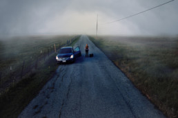
Here was the first sketch idea.
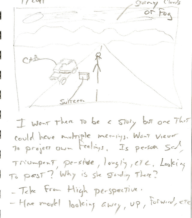
As you can see I'm not much of an artist, but I was able to sketch enough of the idea to convey the idea and remind myself of the details. Here is the resulting image:

As you can see the image is almost exactly as described in the sketchbook and I don't think I would have been able to take a photo like this if I had not planned it out first in the sketchbook.
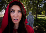
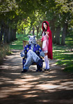
A fellow photographer friend approached me a few weeks later and asked for my help in doing a Little Red Riding Hood themed shoot. I didn't really have any ideas ready for such a shoot so I started thinking about it and over the next few days wrote my ideas in the sketchbook. Here is the result.
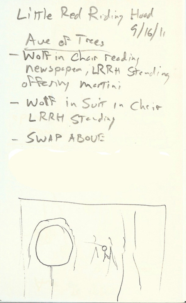
Here are the resulting photos
Again the resulting photographs were very similar to the ideas in the sketchbook.
Over the next couple of months I continued adding ideas to the sketchbook and realized I was coming up with a lot of ideas but not implementing any of them. So I booked some models and over the next couple of weeks knocked off 4 ideas from the sketchbook. Here's the latest
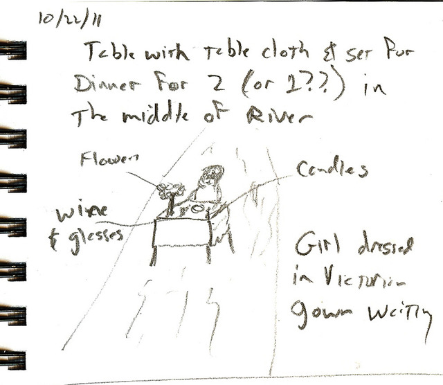
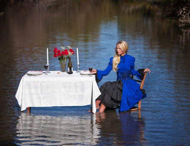
So just like a filmmaker will make a storyboard for their film, making a sketch of the photo idea helps to visualize the idea and acts as a reminder for all the details.
When I started the workshop with John Paul Caponigro I was very skeptical of the whole sketching idea. I am more of a left brain type guy and sketching seemed more right brain and not for me. But I decided to try everything John Paul suggested and have been ecstatic with the result. As I said the workshop changed my approach to photography (hopefully for the better :) ). The sketchbook is a now a solid part of my workflow and is a tool I will use for the rest of my photographic career. Give it a try.


